Spacing in Bootstrap : Being one of the most preferred responsive framework i.e, Bootstrap 4 has some of the best spacing management to impart higher UI and UX to make frond make more adaptable to user needs. In this blog we are going to study the spacing behaviour of the website elements within layout.
With shorthand responsive margin and padding utility classes you can assign specific values to the parent and child elements accordingly. These shorthand notation has support for both horizontal and Vertical spacing properties related to the HTML elements being used.
These new notations and markups for spacing are based on breakpoints only with
Where Specific property
Where sides is one of:
Where size is one of:
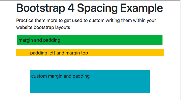
Here are few spacing examples as per the values that imparts the specific behaviour to the layout.
<div class="m-1 p-1 bg-success">margin and padding </div>
<div class="pl-5 mt-3 bg-warning">padding left and margin top</div>
<div class="m-5 pl-1 pt-2 pb-5 bg-info">custom margin and padding</div>
Now we will study various default spacing that are used in Bootstrap and their custom values that we can assign them accordingly.
Line Spacing is governed by line-height CSS element as the Bootstrap default line-height is 1.5, one can make changes on the that values to get specific behaviour for custom design.
With these shorthand notation one can easily add margins and padding to the bootstrap column to impart spacious elements that imparts better UI behaviour to the web page respectively.
With new notation you need to add specific classes like mb-3 to respective element for vertical spacing between the elements. Here is a quick example for this behaviour.
By default there are no margin-bottom in Bootstrap 4 rows and you need to add specific class with(mb-4) right notation to get the right result. Check the below example to get more info on how to add spacing between rows in bootstrap.
Check out the below example for understanding the spacing for div in bootstrap with code and examples in live editor.
In this below example we have acknowledged the default table spacing within bootstrap element and how we can customize to match design requirements.
With simple notation you can add custom spacing between the buttons element for bootstrap and impart higher UI for the viewers.
Here is quick example for spacing between multiple grids and notation marked to manage the design in the grids.
There were few spacing classes which were used in their latest version and have now been introduced further short markup.
Built-in Margin and Padding classes in Bootstrap 3: Values changed from 0 to 3 in em and changed as the per the breakpoints in the grid layout for Bootstrap respectively.
.padding-xs { padding: .25em; }
.padding-sm { padding: .5em; }
.padding-md { padding: 1em; }
.padding-lg { padding: 1.5em; }
.padding-xl { padding: 3em; }

.padding-x-xs { padding: .25em 0; }
.padding-x-sm { padding: .5em 0; }
.padding-x-md { padding: 1em 0; }
.padding-x-lg { padding: 1.5em 0; }
.padding-x-xl { padding: 3em 0; }

.padding-y-xs { padding: 0 .25em; }
.padding-y-sm { padding: 0 .5em; }
.padding-y-md { padding: 0 1em; }
.padding-y-lg { padding: 0 1.5em; }
.padding-y-xl { padding: 0 3em; }

.padding-top-xs { padding-top: .25em; }
.padding-top-sm { padding-top: .5em; }
.padding-top-md { padding-top: 1em; }
.padding-top-lg { padding-top: 1.5em; }
.padding-top-xl { padding-top: 3em; }

.padding-right-xs { padding-right: .25em; }
.padding-right-sm { padding-right: .5em; }
.padding-right-md { padding-right: 1em; }
.padding-right-lg { padding-right: 1.5em; }
.padding-right-xl { padding-right: 3em; }

.padding-bottom-xs { padding-bottom: .25em; }
.padding-bottom-sm { padding-bottom: .5em; }
.padding-bottom-md { padding-bottom: 1em; }
.padding-bottom-lg { padding-bottom: 1.5em; }
.padding-bottom-xl { padding-bottom: 3em; }

.padding-left-xs { padding-left: .25em; }
.padding-left-sm { padding-left: .5em; }
.padding-left-md { padding-left: 1em; }
.padding-left-lg { padding-left: 1.5em; }
.padding-left-xl { padding-left: 3em; }

.margin-xs { margin: .25em; }
.margin-sm { margin: .5em; }
.margin-md { margin: 1em; }
.margin-lg { margin: 1.5em; }
.margin-xl { margin: 3em; }

.margin-x-xs { margin: .25em 0; }
.margin-x-sm { margin: .5em 0; }
.margin-x-md { margin: 1em 0; }
.margin-x-lg { margin: 1.5em 0; }
.margin-x-xl { margin: 3em 0; }

.margin-y-xs { margin: 0 .25em; }
.margin-y-sm { margin: 0 .5em; }
.margin-y-md { margin: 0 1em; }
.margin-y-lg { margin: 0 1.5em; }
.margin-y-xl { margin: 0 3em; }

.margin-top-xs { margin-top: .25em; }
.margin-top-sm { margin-top: .5em; }
.margin-top-md { margin-top: 1em; }
.margin-top-lg { margin-top: 1.5em; }
.margin-top-xl { margin-top: 3em; }

.margin-right-xs { margin-right: .25em; }
.margin-right-sm { margin-right: .5em; }
.margin-right-md { margin-right: 1em; }
.margin-right-lg { margin-right: 1.5em; }
.margin-right-xl { margin-right: 3em; }

.margin-bottom-xs { margin-bottom: .25em; }
.margin-bottom-sm { margin-bottom: .5em; }
.margin-bottom-md { margin-bottom: 1em; }
.margin-bottom-lg { margin-bottom: 1.5em; }
.margin-bottom-xl { margin-bottom: 3em; }

.margin-left-xs { margin-left: .25em; }
.margin-left-sm { margin-left: .5em; }
.margin-left-md { margin-left: 1em; }
.margin-left-lg { margin-left: 1.5em; }
.margin-left-xl { margin-left: 3em; }
With Custom layout used all around the web these special spacing can help you make better online designs with better spacing all around.
When it comes to children, there’s one universal truth: the right toy can spark imagination, build skills, and make memories…
In today’s digital age, where screens and gadgets dominate our children’s lives, there’s something heartwarming about a well-loved plush toy…
In a world dominated by screens and fast-paced routines, it’s easy to forget the simple magic of a toy in…
In the heart of Delhi’s vibrant streets lies a world where imagination meets innovation — the magical universe of toys.…
When was the last time a toy truly amazed you—not just as a product, but as a thoughtful tool for…
In the digital age, the way we experience childhood has changed, but the essence remains the same—imagination, exploration, and joy.…