Bootstrap nav pills are an important part which are used for website menu navigation respectively. They can be used inline, vertical, with different size, color, with toggle and more examples that are discussed below for step by step learning. See the image below for default view of Bootstrap 3 Nav Pills.
When creating Bootstrap pills add specific class .nav-pills to the ul li menu HTML structure, this will impart a default CSS behavior to the layout accordingly.
<div class="container">
  <h3>Default Bootstrap 3 Pills Example</h3>
  <ul class="nav nav-pills">
    <li class="active"><a href="http://www.tutorialmines.net">Home</a></li>
    <li><a href="http://www.tutorialmines.net/bootstrap-3-tutorial/">Bootstrap 3</a></li>
    <li><a href="http://www.tutorialmines.net/php-5-string-functions/">PHP 5</a></li>
    <li><a href="http://www.tutorialmines.net/responsive-web-design-tutorial/">RWD</a></li>
  </ul>
</div> With bootstrap you get the default behavior in Bootstrap pills characterized by float left & margin 2px on li element, border radius(4x) on anchor element with BackgroundCurious Blue color (#337ab7) and white (#fff) as font color. Current Page of the layout is market with li .active class to signify its presence accordingly.
.nav-pills>li
{float:left}
.nav-pills>li>a
{border-radius:4px}
.nav-pills>li+li
{margin-left:2px}
.nav-pills>li.active>a,.nav-pills>li.active>a:focus,.nav-pills>li.active>a:hover
{color:#fff;background-color:#337ab7}
Now we will study the various uses, issues and fixes that comes with Bootstrap Pills in website layout accordingly.
Now to use this combination in the vertical position you need to .nav-stacked CSS class to your ul along with nav and nav-pill simultaneously for imparting specific behavior.
.nav-stacked>li{float:none}
.nav-stacked>li+li{margin-top:2px;margin-left:0} For using centered Nav pills use .nav-justified class which will impart specific behavior to the whole Nav structure accordingly.
nav-justified>li>a {
    margin-bottom: 5px;
    text-align: center;
} In large Screens
Screen Size smaller than 786px
In Bootstrap default colors are defined for each of their component, for changing you must override them in your current CSS file to impart specific behavior. In Bootstrap Nav pill, we will now study to change the background color, text color, active only color and hover change color respectively with the table given below.
| Row | Default color | New color | Try it Editor |
|---|---|---|---|
| Bootstrap Nav Pills Background Color | Curious Blue color (#337ab7) | Red(#ff0000) | Try it now |
| Bootstrap Nav Pills Text color (Font) | White(#fff) | Black(#000) | Try it now |
| Bootstrap nav pills active color | White | Aqua | Try it now |
| Bootstrap Pill hover color | #eee | Black(#000) | Try it now |
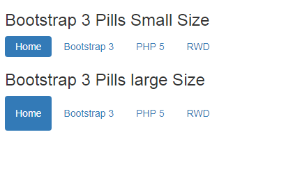
If you are looking to change the size then we need to change the default padding settings of the ul li structure. To avoid conflicts use these CSS specifications in new file for effective changes accordingly. Default values for Bootstrap Pill height are governed by the following CSS and now get effective change in size or height with new values in current CSS file rather than making changes in the Bootstrap original files.
.nav>li>a {
    position: relative;
    display: block;
    padding: 10px 15px;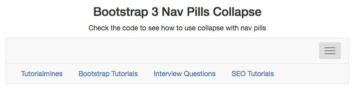
} You can also use the Bootstrap Collapse with nav pills that will impart specific design behaviour for menu. It will show menu on click like any content behaviour with collapse.
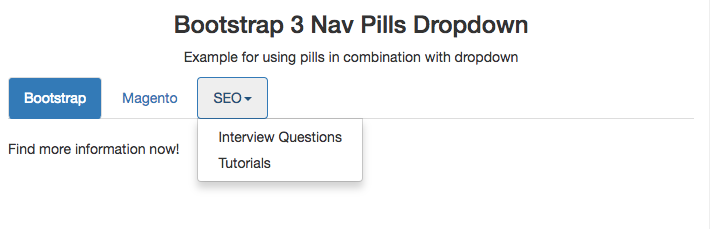
You can also use these nav pills in dropdown with suitable code and get the right design for your website layout.
Here is a quick look of its output.
When it comes to children, there’s one universal truth: the right toy can spark imagination, build skills, and make memories…
In today’s digital age, where screens and gadgets dominate our children’s lives, there’s something heartwarming about a well-loved plush toy…
In a world dominated by screens and fast-paced routines, it’s easy to forget the simple magic of a toy in…
In the heart of Delhi’s vibrant streets lies a world where imagination meets innovation — the magical universe of toys.…
When was the last time a toy truly amazed you—not just as a product, but as a thoughtful tool for…
In the digital age, the way we experience childhood has changed, but the essence remains the same—imagination, exploration, and joy.…