Understanding Bootstrap 4 Modal
Bootstrap Modal: This dialog box/popup window which will be displayed on top of the current page in the form of Window disabling the background window. Once you click on the along background or the close button the Modal box disappears completely.
- Modals are made up of with HTML, CSS & JavaScript combined
- Modals are applied with position:fixed so they are placed everything over body
- When you click on the backdrop or close button the Modal disappears from the screen
- Bootstrap recommends only one modal at one time to avoid any bad user experience
- Using position fixed can mess with other HTML elements so they need to fixed accordingly
Bootstrap 4 Modal Example
How to Build Bootstrap 4 Modal:
- Use class .modal for the main element that needs to be represented
- Both specific classes .modal-dialog & .modal-content are used in accordance for role assigning and define the modal content part.
- Modal has three basic components being header (.modal-header), body element(.modal-body). & footer (.modal-footer)
- There has to be toggle or button to call the Modal dialog box which has to be done with specific id that must be called on both sides.
- You can add custom content and define its property as normal HTML
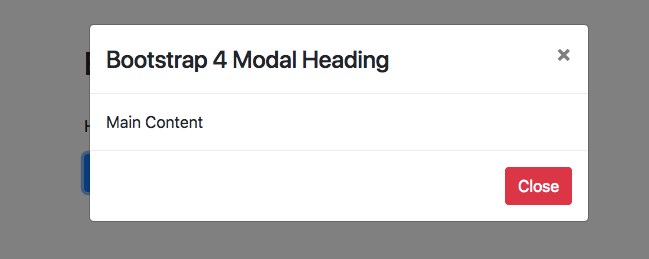
<div class="container mt-4">
  <h2 class="pb-4 pt-4">Bootstrap 4 Modal Example</h2>
  <p>Here is default presentation of Bootstrap Model</p>

<button type="button" class="btn btn-primary" data-toggle="modal" data-target="#demo">
Click for Modal Window </button>

  <div class="modal" id="demo">

    <div class="modal-dialog">
      <div class="modal-content">

        <!-- Modal Header -->
        <div class="modal-header">
          <h4 class="modal-title">Bootstrap 4 Modal Heading</h4>
          <button type="button" class="close" data-dismiss="modal">X</button></div>

        <!-- Modal body -->
        <div class="modal-body">Main Content</div>

        <!-- Modal footer -->
        <div class="modal-footer">
          <button type="button" class="btn btn-danger" data-dismiss="modal">Close</button>
        </div>

      </div>
    </div>
  </div>

</div>Bootstrap 4 Modal CSS
.modal-open{overflow:hidden}

.modal{position:fixed;top:0;right:0;bottom:0;left:0;z-index:1050;display:none;overflow:hidden;outline:0}

.modal-open .modal{overflow-x:hidden;overflow-y:auto}

.modal-dialog{position:relative;width:auto;margin:.5rem;pointer-events:none}

.modal.fade .modal-dialog{transition:-webkit-transform .3s ease-out;transition:transform .3s ease-out;transition:transform .3s ease-out,-webkit-transform .3s ease-out;-webkit-transform:translate(0,-25%);transform:translate(0,-25%)}
@media screen and (prefers-reduced-motion:reduce){.modal.fade .modal-dialog{transition:none}}

.modal.show .modal-dialog{-webkit-transform:translate(0,0);transform:translate(0,0)}
.modal-dialog-centered{display:-ms-flexbox;display:flex;-ms-flex-align:center;align-items:center;min-height:calc(100% - (.5rem * 2))}

.modal-content{position:relative;display:-ms-flexbox;display:flex;-ms-flex-direction:column;flex-direction:column;width:100%;pointer-events:auto;background-color:#fff;background-clip:padding-box;border:1px solid rgba(0,0,0,.2);border-radius:.3rem;outline:0}

.modal-backdrop{position:fixed;top:0;right:0;bottom:0;left:0;z-index:1040;background-color:#000}
.modal-backdrop.fade{opacity:0}
.modal-backdrop.show{opacity:.5}

.modal-header{display:-ms-flexbox;display:flex;-ms-flex-align:start;align-items:flex-start;-ms-flex-pack:justify;justify-content:space-between;padding:1rem;border-bottom:1px solid #e9ecef;border-top-left-radius:.3rem;border-top-right-radius:.3rem}
.modal-header .close{padding:1rem;margin:-1rem -1rem -1rem auto}

.modal-title{margin-bottom:0;line-height:1.5}

.modal-body{position:relative;-ms-flex:1 1 auto;flex:1 1 auto;padding:1rem}

.modal-footer{display:-ms-flexbox;display:flex;-ms-flex-align:center;align-items:center;-ms-flex-pack:end;justify-content:flex-end;padding:1rem;border-top:1px solid #e9ecef}
.modal-footer>:not(:first-child){margin-left:.25rem}.modal-footer>:not(:last-child){margin-right:.25rem}

.modal-scrollbar-measure{position:absolute;top:-9999px;width:50px;height:50px;overflow:scroll}

@media (min-width:576px){.modal-dialog{max-width:500px;margin:1.75rem auto}.modal-dialog-centered{min-height:calc(100% - (1.75rem * 2))}.modal-sm{max-width:300px}}

@media (min-width:992px){.modal-lg{max-width:800px}}
Bootstrap 4 Modal styles
Now we are going to study various styles associated with Bootstrap 4 Modal
Bootstrap 4 Modal Open on Page Load
Bootstrap Modal Default Open: To make Bootstrap modal open default you need to add specific JS script to the whole layout.
<script type="text/javascript">
    $(window).on('load',function(){
        $('#demo').modal('show');
    });
</script>Bootstrap Modal Size
There are three default modal sizes that are used for which specific classes needs to be added with .modal-dialog element.
- Bootstrap Modal Small:- Use specific class .modal-sm with width defined at max-width:300px.
- Bootstrap Modal Default:- Just use modal default classes
- Bootstrap Modal Large:- Here you need to add class .modal-lg for large size
Bootstrap modal Height: You can add specific heights to the Modal dialog box with CSS and JS to make it match your website layout.
Bootstrap 4 Modal Vertical Center
To make Bootstrap modal dialog box vertical center you need to add specific class to .modal-dialog-centered to .modal-dialog
Bootstrap Modal Window
Bootstrap 4 Modal Popup Example
You can also specify tooltips to the bootstrap modal by adding these values in the modal body.
Bootstrap Modal Form
Check out a simple bootstrap modal form that can take values and submit the data to the database just like a normal website form.
Bootstrap 4 Modal Confirm Delete
Bootstrap Confirm Dialog: You can create confirm delete with modal to add YES/NO options that can be easily adjusted with submit form that can be further added in the database.
Bootstrap Modal Tooltip
You can also specify tooltips to the bootstrap modal by adding these values in the modal body. When they are used inside modal tooltips tends to show behaviour of modal only and close out once their backdrop are clicked.
Bootstrap Modal Box
Modal are used extensively as a way to get your message and information being delivered to user as popup message box. In popular terms they are also known as ‘Bootstrap Dialog Box or Message box‘.
Bootstrap Modal Template
Also check out this complete bootstrap modal tutorial with template