Bootstrap 3 Jumbotron: Jumbotron is another lightweight and flexible component to enhance and give special attention to its content of text and images inside it. Here is the default view of the Bootstrap Jumbotron that can bring focus directly to the eyes of the viewers itself. There are few changes in the latest Bootstrap 4 Jumbotron which are also explained later.
.Jumbotron is a class in which h1 and p elements have specific CSS values on which the entire design is built. Simply name the parent container div class .jumbotron and the whole layout design will come in the front.
To make Bootstrap Jumbotron full width and without round corners, add the .container (max-width: 100%;) class after the jumbotron class or not at all to get a complete full page view. For more info read it here Bootstrap Jumbotron Full Width.
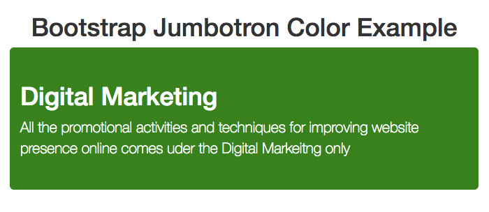
 <div class="jumbotron">
    <h1>Digital Marketing</h1>
    <p>All the promotional activities and techniques for improving website presence online comes under the Digital Marketing only</p>
</div> This is the less version of the CSS followed by the default values of the Bootstrap Jumbotron CSS
//
// Jumbotron
// --------------------------------------------------

.jumbotron {
  padding-top:    @jumbotron-padding;
  padding-bottom: @jumbotron-padding;
  margin-bottom: @jumbotron-padding;
  color: @jumbotron-color;
  background-color: @jumbotron-bg;

  h1, .h1 {color: @jumbotron-heading-color}

  p {
    margin-bottom: (@jumbotron-padding / 2);
    font-size: @jumbotron-font-size;
    font-weight: 200;}

  hr {border-top-color: darken(@jumbotron-bg, 10%);}

  .container &,
  .container-fluid & {
    border-radius: @border-radius-large; // Only round corners at higher resolutions if contained in a container
    padding-left:  (@grid-gutter-width / 2);
    padding-right: (@grid-gutter-width / 2);
  }

  .container {max-width: 100%;}

  @media screen and (min-width: @screen-sm-min) {
    padding-top:    (@jumbotron-padding * 1.6);
    padding-bottom: (@jumbotron-padding * 1.6);

    .container, .container-fluid  {
      padding-left:  (@jumbotron-padding * 2);
      padding-right: (@jumbotron-padding * 2);}

    h1, .h1 {font-size: @jumbotron-heading-font-size;}
}
Main Classes that are used within are specifically .jumbotron only along with adjustable h1 and p tag with variable sizes with .container or .container-fluidclasses. Here is the default CSS of the Bootstrap Jumbotron that is characterized by its extra margin, padding, height, width and font color.
.jumbotron {  padding-top: 30px;  padding-bottom: 30px;  margin-bottom: 30px;  color: inherit;  background-color: #eee;}
.jumbotron h1, .jumbotron .h1 {  color: inherit;}
.jumbotron p {  margin-bottom: 15px;  font-size: 21px;  font-weight: 200;}
.jumbotron > hr {  border-top-color: #d5d5d5;}
.container .jumbotron, .container-fluid .jumbotron {  padding-right: 15px;  padding-left: 15px;
  border-radius: 6px;}
.jumbotron .container {  max-width: 100%;}

@media screen and (min-width: 768px)
{  .jumbotron {    padding-top: 48px;    padding-bottom: 48px;  }
  .container .jumbotron,  .container-fluid .jumbotron {    padding-right: 60px;    padding-left: 60px;  }
  .jumbotron h1,  .jumbotron .h1 {    font-size: 63px;  }
} To make the Bootstrap Jumbotron full width and without any round corners, you need to add the corresponding class .jumbotron-fluid and placing .container .container-fluid within the whole layout. This CSS attributes allow jumbotron to cover the whole horizontal space within the parent element.
You can customize bootstrap with different color, resize it, add image and also get full template to enjoy with it.
Now we will study about the various Bootstrap Jumbotron Styles and common practical issues you will face while working with it.
You can change Color setting by adding the respective values and overriding the default values. There are two specific with Bootstrap Jumbotron Background Color and text color which can be styled to match the website design.
Bootstrap jumbotron default color for font is black so you can simple override the values to match your content accordingly.
.jumbotron { color:white;}
Bootstrap Jumbotron Background color: Default background color is #eee which you can change too with specific CSS values [.jumbotron {background-color:green;}].
Images are part of almost every layout and you can add them in bootstrap as well. We will take the help of Bootstrap image Classes to make them more effective whenever required. Here we have added a simple image to the top right corner of the Bootstrap jumbotron layout.
    .jumbotron {
    background-image: url("http://www.tutorialmines.net/wp-content/uploads/2015/11/info-icon.png");
    min-height: 50%;
    background-repeat: no-repeat;
    background-position: right top;
} You can use background image with CSS values to place it on the background of the Jumbotron. Here is quick CSS fix for this.
.jumbotron {
    margin-bottom: 0px;
    background-image: url(https://www.tutorialmines.net/wp-content/uploads/2018/11/bg.jpg);
    background-position: 0% 25%;
    background-size: cover;
    background-repeat: no-repeat;
    color: white;
    text-shadow: black 0.1em 0.1em 0.1em;
} : To make this image responsive you need to add specific class that imparts responsive behavior to the whole design respectively. Image may be small or large for which you have to apply the suitable CSS to get the desired effect. Here are few options to begin with and try to change their value for seeing the effect in our try it live editor now!
.jumbotron {
    background-image: url(https://www.tutorialmines.net/wp-content/uploads/2018/11/bg.jpg);
    background-size: cover;
  -webkit-background-size: 100% 100%;
    -moz-background-size: 100% 100%;
    -o-background-size: 100% 100%;
    background-size: 100% 100%;
} Jumbotron takes the size of its container only but you can define specific CSS values to make it accomodate the size accordingly.
.jumbotron {
    min-height: 250px;
} // will restrict the layout to take minimum height of 250 px
 irrespective of the elements inside

.jumbotron {
    padding: 5em inherit;
} //You can add the corresponding values to get desired results
Changing Height in Bootstrap Jumbotron
Here is full fledged template with Bootstrap jumbotron that you can use for website and add this amazing functionality accordingly.
Also Check
Bootstrap Tutorial PDF
Bootstrap Interview Questions
When it comes to children, there’s one universal truth: the right toy can spark imagination, build skills, and make memories…
In today’s digital age, where screens and gadgets dominate our children’s lives, there’s something heartwarming about a well-loved plush toy…
In a world dominated by screens and fast-paced routines, it’s easy to forget the simple magic of a toy in…
In the heart of Delhi’s vibrant streets lies a world where imagination meets innovation — the magical universe of toys.…
When was the last time a toy truly amazed you—not just as a product, but as a thoughtful tool for…
In the digital age, the way we experience childhood has changed, but the essence remains the same—imagination, exploration, and joy.…