Bootstrap Dropdown:These are toggle based pre-defined way of building menus in Bootstrap with lots of options to choose from. Dropdown are one of the main components of Bootstrap being part of every website layout so make sure you understand the fundamentals for using this comprehensive features.
To build bootstrap 4 dropdown you need to begin with step by step
Check the below code and test it in editor to make further progress.
  <div class="dropdown">
    <button type="button" class="btn btn-primary dropdown-toggle" data-toggle="dropdown">
      Dropdown button
    </button>
    <div class="dropdown-menu">
      <a class="dropdown-item" href="#">HTML</a>
      <a class="dropdown-item" href="#">CSS</a>
      <a class="dropdown-item-text" href="#">JS</a>
      <span class="dropdown-item-text" href="#">Tutorialmines</span>
    </div>
</div> This is the default CSS for Bootstrap dropdown with its various uses with toggle menu, header, dropdown-item, dropdown-item-text and more thorough guidance. Also check out the specific bootstrap 4 dropdown menu css with its specific values.
.dropdown,.dropleft,.dropright,.dropup{position:relative}

.dropdown-toggle::after{display:inline-block;width:0;height:0;margin-left:.255em;vertical-align:.255em;content:"";border-top:.3em solid;border-right:.3em solid transparent;border-bottom:0;border-left:.3em solid transparent}
.dropdown-toggle:empty::after{margin-left:0}

.dropdown-menu{position:absolute;top:100%;left:0;z-index:1000;display:none;float:left;min-width:10rem;padding:.5rem 0;margin:.125rem 0 0;font-size:1rem;color:#212529;text-align:left;list-style:none;background-color:#fff;background-clip:padding-box;border:1px solid rgba(0,0,0,.15);border-radius:.25rem}
.dropdown-menu-right{right:0;left:auto}
.dropup .dropdown-menu{top:auto;bottom:100%;margin-top:0;margin-bottom:.125rem}

.dropright .dropdown-menu{top:0;right:auto;left:100%;margin-top:0;margin-left:.125rem}
.dropleft .dropdown-menu{top:0;right:100%;left:auto;margin-top:0;margin-right:.125rem}

.dropdown-menu.show{display:block}
.dropdown-menu[x-placement^=left],.dropdown-menu[x-placement^=right],.dropdown-menu[x-placement^=top]{right:auto;bottom:auto}.dropdown-divider{height:0;margin:.5rem 0;overflow:hidden;border-top:1px solid #e9ecef}

.dropup .dropdown-toggle::after{display:inline-block;width:0;height:0;margin-left:.255em;vertical-align:.255em;content:"";border-top:0;border-right:.3em solid transparent;border-bottom:.3em solid;border-left:.3em solid transparent}
.dropup .dropdown-toggle:empty::after{margin-left:0}

.dropright .dropdown-toggle::after{display:inline-block;width:0;height:0;margin-left:.255em;vertical-align:.255em;content:"";border-top:.3em solid transparent;border-right:0;border-bottom:.3em solid transparent;border-left:.3em solid}
.dropright .dropdown-toggle:empty::after{margin-left:0}.dropright .dropdown-toggle::after{vertical-align:0}


.dropleft .dropdown-toggle::after{display:inline-block;width:0;height:0;margin-left:.255em;vertical-align:.255em;content:""}
.dropleft .dropdown-toggle::after{display:none}
.dropleft .dropdown-toggle::before{display:inline-block;width:0;height:0;margin-right:.255em;vertical-align:.255em;content:"";border-top:.3em solid transparent;border-right:.3em solid;border-bottom:.3em solid transparent}
.dropleft .dropdown-toggle:empty::after{margin-left:0}.dropleft .dropdown-toggle::before{vertical-align:0}.dropdown-menu[x-placement^=bottom],

.dropdown-item{display:block;width:100%;padding:.25rem 1.5rem;clear:both;font-weight:400;color:#212529;text-align:inherit;white-space:nowrap;background-color:transparent;border:0}.dropdown-item:focus,.dropdown-item:hover{color:#16181b;text-decoration:none;background-color:#f8f9fa}
.dropdown-item.active,.dropdown-item:active{color:#fff;text-decoration:none;background-color:#007bff}
.dropdown-item.disabled,.dropdown-item:disabled{color:#6c757d;background-color:transparent}

.dropdown-header{display:block;padding:.5rem 1.5rem;margin-bottom:0;font-size:.875rem;color:#6c757d;white-space:nowrap}

.dropdown-item-text{display:block;padding:.25rem 1.5rem;color:#212529} Here are the main classes associated with this Bootstrap Dropdown with its use and try it editor.
[table class=”table-bordered bootstrap-table” caption=”Bootstrap Dropdown Classes” width=”” colwidth=”” colalign=”” border=”1″]
Class Name,Description,Example
dropdown,This Sets the whole dropdown to be used within the web layout,Try it Editor
dropdown-menu,Sets the whole menu arrangements with in dropdown,Try it Editor
dropdown-menu-right,Sets the right menu alignment,Try it Editor
dropdown-header,Sets the separate header section within dropdown,Try it Editor
dropdown-toggle,Sets the dropdown to be used as toggle,Try it Editor
dropdown-divider,Sets the horizontal line,Try it Editor
dropdown-item,This sets the every item inside the dropdown menu,Try it Editor
dropdown-item-text,This sets the text item inside the dropdown menu,Try it Editor
dropdown-item active,This Sets the item to highlighted in blue color, Try it Editor
dropdown-item disabled,This sets the item to be dull grey with unclickable state,Try it Editor
dropdown-toggle-split,This shows the separation between the dropdoown button and clickable area separately,Try it Editor
dropup,Displays the menu above the button rather than below,Try it Editor
dropright,Displays the dropup menu right side of the button,Try it Editor
dropleft,Displays the dropup menu left side of the button,Try it Editor
[/table]
You can change the size of dropdown by adding different class to make it look larger or smaller as per the layout requirements.
Bootstrap 4 Dropdown color: Here we have added colors to the default button behaviour with specific button color classes. Otherwise you can also use all utility classes to give better presentation that matches the layout respectively.
Bootstrap Dropdown can be integrated with many variations and styles to be integrated in websites for their respective use. Here we are going to discuss some of their most common use with adding divider, header, active and disable item, dropdown position (with left right and bottom), Use as Menu & SubMenu, Width, Dropdown on Hover, with images, with icons, seachbox, and with inverse dropup positions as well.
Bootstrap Dropdowns are mostly used as menus in the navigation part of the websites. Hence their use is imminent in websites and we have some examples for Bootstrap dropdown for ready to use.
Bootstrap Dropdown Menu left Side
Bootstrap Dropdown Menu Right Side
Bootstrap Dropdown Menu on hover Example
Bootstrap Dropdown Menu Animation Example
Now to make a item within the menu highlighted being separate from the rest, a divider is there which when used place the item with horizontal bar above it. You need to use specific class .dropdown-divider to get the desired pattern with dropdown.
You can also specific small heading in the menu area with class .dropdown-header that displays items with mentioned heading.
To make items more highlight and their active you can just add specific .active class that will make separate from others and use .disabled class in the dropdown-item to make them dull grey. Here is quick code to try it on live server.
By default dropdown is positioned at down position but with specific CSS you can make it appear towards left, right and up that suits best with your layout with respective CSS Classes.
specific class make the dropdown appear to upside
We will be studying these layout one by one with example and code to understand it further.
To make the menu appear left side you need to give proper spacing to the element for opening on the left side, for which we have add .float-right property to make it left side open for menu to appear.
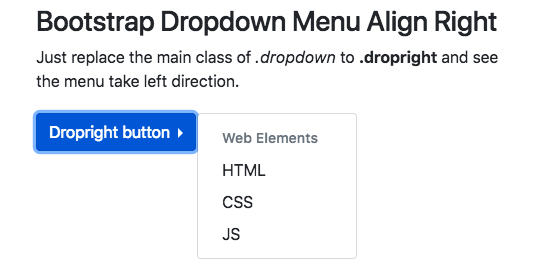
As the case above you need to replace the main dropdown class with .dropleft for getting the bootstrap menu align left.
To make dropdown appear right side you need to add specific class .dropdown to the main parent element. Check out the below code to further add your understanding.
To make the menu open up you need to give proper spacing to the button and replace the main .dropdown class to .dropup which takes the specific CSS to change the position of the arrow and give desired result to the menu layout accordingly.
To increase the width of the Bootstrap dropdown you have to add custom CSS to get the desired result.
.dropdown-menu {
    min-width: 15rem;
} We can also use the Bootstrap dropdown as Submenu too with similar properties with an extra element and behaviour to match the design. Here is quick example for it with different position shared below that.
Bootstrap 4 Dropdown Submenu Left
Bootstrap 4 Dropdown Submenu Right
Bootstrap 4 Dropdown Submenu Horizontal
Bootstrap 4 Dropdown Submenu Animation
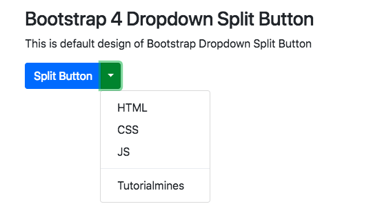
With separate split button you can place the main menu heading separate from the toggle area. This is done to make sure there are proper alignments for opening menu alongside menus.It is done by using the grouping of buttons and .dropdown-toggle-split to the second button. Check out the code for better understanding fo the whole design.
You can add all type custom animation hover and transition too. So here we are sharing one of the most sought bootstrap menu dropdown on hover . It uses JavaScript with custom classes to suit website layout.
Here is another example for bootstrap dropdown on hover with specific CSS values and JavaScript.
With lot of options being available for menu items, you can also give specific Search functionality with bootstrap dropdowns. This searchable dropdowns are quite popular with lot of website layout and we will adding a suitable example for this soon!
In this example we have one sample image in the Bootstrap dropdown to be integrated with menu.
Now using Bootstrap dropdown with icons in parallel with regular text.
When it comes to children, there’s one universal truth: the right toy can spark imagination, build skills, and make memories…
In today’s digital age, where screens and gadgets dominate our children’s lives, there’s something heartwarming about a well-loved plush toy…
In a world dominated by screens and fast-paced routines, it’s easy to forget the simple magic of a toy in…
In the heart of Delhi’s vibrant streets lies a world where imagination meets innovation — the magical universe of toys.…
When was the last time a toy truly amazed you—not just as a product, but as a thoughtful tool for…
In the digital age, the way we experience childhood has changed, but the essence remains the same—imagination, exploration, and joy.…