Bootstrap Collapse: With this JS functionality in Bootstrap you can hide or show content which will open only when you click on the element. This can also be used as menu, with Navbar, table, panel and many more styles that are we going to study in this post. Here is quick look at bootstrap collapse default state.
Bootstrap Collapse functionality is based on JavaScript with data-toggle=”collapse” attribute to main element. Here we will be adding collapse to button or link respectively.
How to use build collapse with Bootstrap?
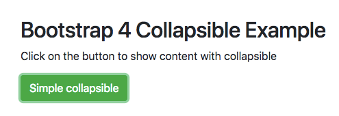
  <h2>Bootstrap 4 Collapsible Example</h2>
  <p>Click on the button to show content with collapsible</p>
  <button type="button" class="btn btn-success" data-toggle="collapse" data-target="#content">Simple collapsible</button>
  <div id="content" class="collapse">
    This way one can easily hide and show content within page for better user experience
  </div>
<p class="mt-5">Click again to hide</p> There are mainly three CSS classes that runs with JS that’s runs the main functionality.
Here have a quick look at the specific CSS values used with Bootstrap collapse component.
@media screen and (prefers-reduced-motion:reduce)
{
.fade{transition:none}}
.fade:not(.show){opacity:0}

.collapse:not(.show){display:none}

.collapsing{
position:relative;
height:0;
overflow:hidden;
transition:height .35s ease
}

@media screen and (prefers-reduced-motion:reduce){
.collapsing{transition:none}
}
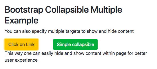
You can also define multiple targets within the same layout by using them with their specific data attribute.
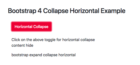
By default collapse is built to collapsing vertically. Now to make it collapse horizontally you need to alter the CSS to make it hide and show along the horizontal for imparting that specific behaviour.
You can integrate collapse element to the navbar menu that will impart artistic animation of menu being easily open or close on users click.
bootstrap navbar collapse on click : Here the whole navbar collapses on click to give way for better UI Experience for mobile users. These menus are now part of online mobile sites that are using collapsible menus for their websites effectively.Check out the following GIF image to understand Navbar
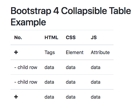
Now we will update collapse inside the table row and column to get the information hide and show to make the UI experience better for user all around.
You can also integrate panel with collapse with specific icons to get the desired result. Panels have now been depreciated in Bootstrap latest version so we have added support for last Bootstrap 3 Version.
Bootstrap 3 Collapse panel with Arrow:You can add icons as per requirements from icon font family.
With Bootstrap 4 default icon support is not there so have add custom CDN support to get the icons from respective font family.
You can also use collapse sidebar as menu for your website. Here is a full example of this with specific values
Also checkout this complete layout being done with various uses of collapse with multiple bootstrap elements.
Also Check
Bootstrap Tutorial PDF
Bootstrap Interview Question and Answers
When it comes to children, there’s one universal truth: the right toy can spark imagination, build skills, and make memories…
In today’s digital age, where screens and gadgets dominate our children’s lives, there’s something heartwarming about a well-loved plush toy…
In a world dominated by screens and fast-paced routines, it’s easy to forget the simple magic of a toy in…
In the heart of Delhi’s vibrant streets lies a world where imagination meets innovation — the magical universe of toys.…
When was the last time a toy truly amazed you—not just as a product, but as a thoughtful tool for…
In the digital age, the way we experience childhood has changed, but the essence remains the same—imagination, exploration, and joy.…