
Bootstrap 3 Badges : Badges are those small extra details that adds extra information to the viewers e.g. small headings, unread notification numbers or messages giving users the vital info. There are specific classes and rules that govern Bootstrap 3 badges that we are going to study in this posts today. They can be integrated with links, button, navbar and many more solutions that imparts specific design to the layout. Here is simple design for Bootstrap 3 Badges.
In this blog you will get complete info on the following info related to Badges
To use Bootstrap badges you need to use them with specific HTML layout and add classes for getting desired output.
<div class="container">
  <h2>Bootstrap 3 Badges Example</h2>
  <hr/>
  <h3>Bootstrap Tutorials<span class="badge badge-primary">New</span></h3>
  <h4>JavaScript Tutorial<span class="badge badge-secondary">New</span></h4>
</div>
Bootstrap 4 Badge Example : With few modification badge is used a lot with latest bootstrap 4.
Check out the below code for bootstrap 4 badge with minor changes in CSS.
Here is the default CSS behavior of the Bootstrap Badges followed by the elements that are used in combination with it. (Updated with latest Bootstrap 4 changes)
.badge {
  display:inline-block;
  padding:.25em .4em;
  font-size:75%;
  font-weight:700;
  line-height:1;
  text-align:center;
  white-space:nowrap;
  vertical-align:baseline;
  border-radius:.25rem
}
Bootstrap Badge CSS behavior when combined with buttons, pills and different types with specific attributes.
.badge:empty{display:none} //Empty Badge

.btn .badge{position:relative;top:-1px} //Badges with Button

.badge-pill{padding-right:.6em;padding-left:.6em;border-radius:10rem} //pills

.badge-primary{color:#fff;background-color:#007bff}
.badge-primary[href]:focus,.badge-primary[href]:hover{color:#fff;text-decoration:none;background-color:#0062cc}
.badge-secondary{color:#fff;background-color:#6c757d}
.badge-secondary[href]:focus,.badge-secondary[href]:hover{color:#fff;text-decoration:none;background-color:#545b62}
.badge-success{color:#fff;background-color:#28a745}
.badge-success[href]:focus,.badge-success[href]:hover{color:#fff;text-decoration:none;background-color:#1e7e34}
.badge-info{color:#fff;background-color:#17a2b8}.badge-info[href]:focus,
.badge-info[href]:hover{color:#fff;text-decoration:none;background-color:#117a8b}
.badge-warning{color:#212529;background-color:#ffc107}.badge-warning[href]:focus,
.badge-warning[href]:hover{color:#212529;text-decoration:none;background-color:#d39e00}
.badge-danger{color:#fff;background-color:#dc3545}
.badge-danger[href]:focus,.badge-danger[href]:hover{color:#fff;text-decoration:none;background-color:#bd2130}
.badge-light{color:#212529;background-color:#f8f9fa}.badge-light[href]:focus,
.badge-light[href]:hover{color:#212529;text-decoration:none;background-color:#dae0e5}
.badge-dark{color:#fff;background-color:#343a40}
.badge-dark[href]:focus,.badge-dark[href]:hover{color:#fff;text-decoration:none;background-color:#1d2124} :empty selector. Now we will study various style that are used in with combination with Bootstrap badges in terms of color, pill badges, over button, on Glyphicons (icons), notification with number, size and more examples to go with it.
There are few default color provided with bootstrap with .badge-primary , .badge-secondary, .badge-success, .badge-danger, .badge-warning, .badge-info, .badge-light, .badge-dark that appears the respective change to the design respectively.
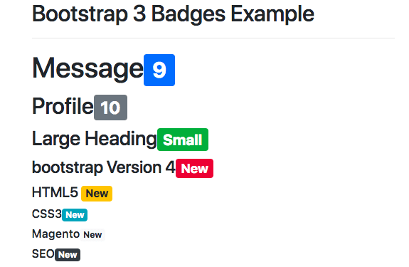
<h1>Message<span class="badge badge-primary">9</span></h1>
<h2>Profile<span class="badge badge-secondary">10</span></h2>
<h3>Large Heading<span class="badge badge-success">Small</span></h3>
<h4>bootstrap Version 4<span class="badge badge-danger">New</span></h4>
<h5>HTML5 <span class="badge badge-warning">New</span></h5>
<h6>CSS3<span class="badge badge-info">New</span></h6>
<h6>Magento<span class="badge badge-light">New</span></h6>
<h6>SEO<span class="badge badge-dark">New</span></h6>
Bootstrap 3 Badge Background Color
One can add custom color to bootstrap 3 badges for matching with site layout and here is given example code with specific requirements.
.badge {
      background-color:green;
} By increasing the value of the border-radius one can convert this badge design into circle. Check out the design below for more.
Badge gets its size from its CSS Characteristics and so you change the size as per increasing or decreasing its value from the original default values.
Bootstrap Badge Small: In similar context you can make the size small to match badges with main heading. You can add custom padding with specific class to get the desired result. You can also change bootstrap badge font size, line height, padding or any other CSS changing behaviour. Check the below try it editor for live results.
.badge1 {padding:1em .4em;}.badge2 {font-size:50%; vertical-align:top;}
.badge3 {line-height:3;}.badge4 {padding:.5em .4em; }
Bootstrap Badge large: You can also increase the values of the specific sizing with padding or any CSS characteristics to make it badge large respectively.
Bootstrap Badge Vertical Align: You can also use vertical align to make it position top the heading like superscript or Vertical align bottom like subscript respectively with change in CSS values. Check the below try it editor for respective change in Badge size height small large, align and more
You can also place the badges inside the navbar that impart that specific behavior to the whole layout with active properties as well.
Bootstrap button provide a systematic way to add badges to them as notification with specific number marking which are quite popular with latest designs.
<button type="button" class="btn btn-primary">
Messages <span class="badge badge-danger">15</span>
</button>
With .badge-pill you can make the badges more round with extra padding which is another important change in the latest bootstrap version.
<h1>Message<span class="badge badge-pill badge-primary">9</span></h1>
<h2>Profile<span class="badge badge-pill badge-secondary">10</span></h2>
<h3>Large Heading<span class="badge badge-pill badge-success">Small</span></h3>
<h4>bootstrap Version 4<span class="badge badge-pill badge-danger">New</span></h4>
In Combination with badges lables are still in use with bootstrap 3 but they have been put together and depreceated in Bootstrap 4 but we have provided with simple example code as well as design. So have a look at their corresponding design.
  <h1>Message<span class="label  label-primary">9</span></h1>
  <h2>Profile<span class="label  label-default">10</span></h2>
  <h3>Large Heading<span class="label label-success">Small</span></h3>
  <h4>bootstrap Version 4<span class="label label-danger">New</span></h4>
  <h5>HTML5 <span class="label label-warning">New</span></h5>
  <h6>CSS3<span class="label label-info">New</span></h6>
When it comes to children, there’s one universal truth: the right toy can spark imagination, build skills, and make memories…
In today’s digital age, where screens and gadgets dominate our children’s lives, there’s something heartwarming about a well-loved plush toy…
In a world dominated by screens and fast-paced routines, it’s easy to forget the simple magic of a toy in…
In the heart of Delhi’s vibrant streets lies a world where imagination meets innovation — the magical universe of toys.…
When was the last time a toy truly amazed you—not just as a product, but as a thoughtful tool for…
In the digital age, the way we experience childhood has changed, but the essence remains the same—imagination, exploration, and joy.…


